Istituto Italiano di Cultura
exhibition mediatext

Exhibition List

Lenders to the Exhibition

Exhibition Design


PRESS

Addendum
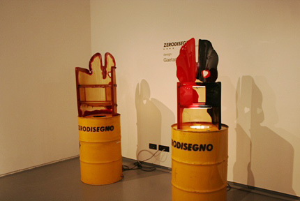
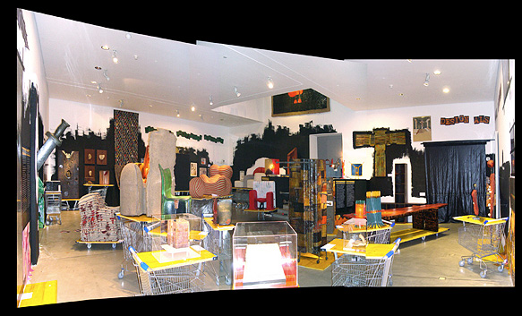
Conceptual basis of the exhibition design of " Gaetano Pesce: Pieces From a Larger Puzzle"
John Geresi


TITLE

The title "Pieces from a Larger Puzzle"  (it was changed from the initial "Pieces of a Larger Puzzle " in consultation with Pesce) was a way to communicate that there was a more complex mosaic of Pesce's work than what people would see in the exhibition. The conscious use of the word "piece" in the title was intended to allow for missing pieces (i.e. the important Pratt chair prototype described in our show catalog) and well as to reference directly each physical piece in (or not in) the show. 
 
A puzzle can be deciphered and/or reconstituted, but sometimes that takes a lot effort. So given the range of Pesce's achievements I wanted folks to understand that "getting" the full puzzle done was partly their responsibility by looking beyond the IIC LA gallery walls.  That is why the exhibition website will have far more than what we have in the show and is an important part of the experience.

Other rejected titles for the exhibition included Gaetano Pesce: a ≠ a, Gaetano Pesce: A Retrospective, and Gaetano Pesce: Pieces from Los Angeles collections'


CHOICE OF VERY BASIC DISPLAY MATERIALS IN THE SALA ITALIA GALLERY
We had no budget for display materials. Wood pallets seemed an inexpensive way to allow us the freedom to move pieces off the ground if necessary.

The pallets aesthetic is also consistent with Arte Povera, which phrase was coined by exhibition catalog contributor Germano Celant, and which developed in the years just after Pesce's shift from a kinetic artist to a designer. The pallets also connote constant movement, and travel has been an essential part of Pesce's life.


BIBLIOTECA (Library) DISPLAY STRATEGY

The decision to separate objects in Tobia Scarpa's vitrines in the Library from the Sala Italia Gallery's more basic display tools was meant to demonstrate the power and the beauty of the individual objects both within a formal space (the vitrines, while modern, are a very traditional design) and in a more raw and informal setting.


ALLUSIONS TO PREVIOUS PESCE EXHIBITIONS
At the exhibition opening celebration, we burned Sandalwood incense in the Library. In the same space a digital version of Pesce's LP record album "La Canzone dello Yeti" from 1970 was playing. This was also the pairing used by Pesce in Paris in 1970 at his show at the Decorative Arts Palazzo at the Louvre in Paris. Absent from our show was the cage which surrounded a grouping of Up 5 and Up 6 chairs, which I considered but eventually did not execute in the main room due to spatial and other constraints.

Milan Furniture Fair 2002 - Our choice to use an oil barrel as a display stand for a Nobody's Perfect Chair reprises Zerodisegno's display of its Nobody's Perfect Collection at the Milan Mobile in 2002 (our barrel did not have corporate graphics affixed). I considered having my son Michael, who has Down Syndrome, handwrite a plaque for the Nobody's Perfect barrel, or have his fellow schoolmates make all of the wall plaques on lined composition paper, but did not make that happen. (I had some concern that people would misunderstand or misinterpret the use of the phrase Nobody's Perfect, which is intended to be life-affirming rather than critical).


The choice to use a shopping cart to display some commercial objects designed by Pesce (the Vesuvio espresso maker and the recent Melissa shoes) was an obvious homage to Vitra's Design Museum's exhibition "Il Rumore del Tempo" in 2005, which Pesce helped design.


Our decision to use a pair of sawhorses with a 4' x 8' piece of plywood laid across them as a display unit was based on the comfort I took from the fact that in his own studio, Pesce has used sawhorses as tables.


In April of 2010 Meritalia introduced a new series of Pesce's furniture in Milan called Senza Fine. The work (and some lamps from a different series ) were displayed on shipping pallets, which was a choice we too had made months before.

We will be sending the stenciled pallets back into the world by selling some of them at the end of the show. That way they will end up in different parts of the world, much like Pesce and his global influence.


OTHER ALLUSIONS

The decision to design and use a twin-front Ladder with unfinished wood planks as a display pedestal was intended to be a visual and intellectual inversion of Franco Albini's tensile bookcase of 1938. Albini's rationality is clearly evident in Pesce's work and methods (it is little know that Pesce studied under Albini as well as under Scarpa), but this takes a more practical approach - the inherent value of using gravity as a friend vs. the tension of fighting it (the tension in Alibini's bookcase eventually destroyed it).


Stencils: We used four stencils of Pesce-designed objects made by an architecture student from SCI-Arc, Brian Zentmyer, from images that I supplied and spray-painted them on some of the pallets, on the sawhorses, and on the award presentation platform. This helped create a specificity for our display tools.

We also included objects that people could touch, because that sensorial tool is an important part of fully understanding and enjoying Pesce's work.


THINGS WE DID NOT, COULD NOT, OR WERE TOO LAZY TO DO OR USE:
We considered making a timeline of the objects in the show in blue painter's tape but provided one in the catalog instead.

On the long wall where the timeline would have gone, we instead used the Pesce quotation "The future is a very beautiful creature. The past is not". I felt this was an interesting choice for a retrospective exhibition, and allowed us to communicate Pesce's idea that the duty and the right of the artist is to be "incoherent " and say opposite things from one day to the next.

We identified a LA-based collector who owns a Moloch lamp, but it is in his home in Germany and he said that it was too fragile to shipped back to LA. In its absence I thought I might get the table lamp by Naska Loris that Pesce used as a model to substitute for the missing Moloch lamp. I would then place a Vitra miniature Up 5 & Up 6 chair underneath it on the Chiat Day desk, and include it in the show that way. The two lamps I found and tried to buy just before the exhibition opened came to naught and we moved on.

We did not find a use for the following, which was considered for the website, the poster, and the on-wall graphics.


For the opening we also decided not to lay Sod on the pallets that hold the Open Sky Baby Crosby and Crosby Chairs. It would have been pretty, but would probably have had to have been done for all pallets, and that seemed excessive. It would also have been interesting to see the grass turn from green yellow over time, and would have given a sense of the show's ephemerality.